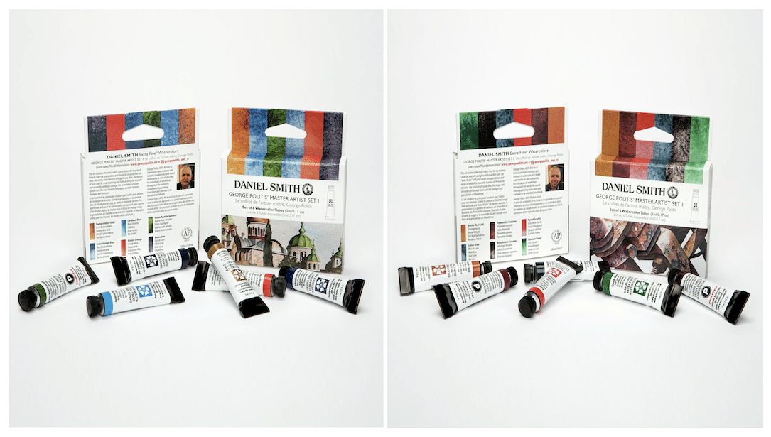
George Politis has been working with DANIEL SMITH Extra Fine Watercolors since 1995 and he admits that he is very drawn to the unique colors in the range. “One of the best qualities is that they are professional grade and yet a beginner can use them without creating mud,” he states. “This is a dynamic way for newer artists to safely build their craft, as they can mix without the common fear of creating mud with one wrong turn and getting discouraged.” George enjoys creating depth in his work with unique colors by mixing directly on the paper to create many layers in the darkest areas of his paintings.
George carefully curated the palettes for his two sets – they’re the perfect option for artists to experience a cohesive palette within the full range of colors. Selecting colors was a difficult task, as he wanted to inspire users to create their own style, yet show off some of the unique combinations of his personal palette. He decided to apply these three rules to guide his choices:
1) Choose colors critical to Greek landscape paintings (his home country)
2) Include Primatek colors with their unique granulation diffusions
3) Introduce impressive metallics which are a must-have for adding the richness of texture
Set I contains the main colors George uses to depict the beauty of Greece. He loves the granulation and clarity of Cerulean Blue for skies, the intensity of Indanthrone Blue, the beauty of Quinacridone Gold for underpainting and light accents, the warmth and versatility of Mayan Orange, the granulation of Green Apatite, and his most favorite Moonglow for textures, shadows and mixtures.”
Set II contains the main colors he uses for textures. He loves the warmth and glow of Aussie Red Gold, the “wow factor” of Pyrrol Scarlet, the range of reddish to brownish nuances of Piemontite Genuine, the intensity of Lunar Blue, the magic and versatility of Cascade Green, and the strength and granulation of Bloodstone.
“DANIEL SMITH is the only brand I’ve worked with that I know I can 100% rely upon for its perfect color transparency, which is critical to my award-winning works. I can truly create a final mix that is clear with very nice color. Other brands leave something behind, creating a color that’s more like looking through a dirty window. This 100% certainty made me fall in love with a newfound freedom.”
This is a true compliment from an artist who loves to try every brand on the global market. Michael Solovyev first discovered DANIEL SMITH when he moved to Canada, after having limited access to art supplies while living in Russia during a Communist regime. He happily tells the story of attending an artist festival where the town square was full of vendor tents, including Daniel Smith. Michael was very surprised that the gentleman working this tent was not a local salesperson, but rather the company owner. “This was amazing to me, that the man at the top of the brand was still engaged with the product and enthusiastically talking with artists. I knew that I was no longer in Russia,” he jokes. “On a serious note, I was very impressed that this was more than business to the owner, it was about innovation – and that stuck with me.” The following year, Michael traveled to the Daniel Smith headquarters to meet with their team, see the operation and develop his own curated set of watercolors.
Michael’s palette usually holds nine colors, which is all he needs for 80% of his work. But for this new set, he chose ten colors with a balance of warm and cool hues that will allow artists to develop a robust color family.
This is a great artist tip from Michael – in other words, to further develop your painting skills, focus on painting shadows. Painting bright light is rather easy, but shadows require an understanding of grays, or rather a mix of grays with different undertones like yellow, orange or red. Knowing your grays will help you complete paintings more quickly as well, which is especially good for plein air work.
Michael suggests trying this technique: Set up several objects for a study and create a palette of grays, use only three colors to create any one gray shade. For example, start with Quinacridone Sienna, Indigo, and Perylene Violet. By changing the balance of these three pigments, you can paint your shadows with a wide range of grays.
Experiment with your palette options in other ways, by mixing two colors from Michael’s set together, such as Indigo and India Yellow. This mix not only yields the perfect color for leaves, it can be altered to match any natural leaf color.
Be in the moment
Michael shares more advice for artists using his set. “If you enjoy the process, it doesn’t matter what you have in the end. Be in the moment, don’t focus on having something nice at the end of the experience. The process is where the life is, so enjoy it!”
He describes watercolor painting as a water game, where the object is to predict the result, while also recognizing that the painting can change every five minutes. This is what he loves most about watercolor, that it’s a “live medium,” always moving and changing. “Watercolor is like a cat – you can’t force it, you just need to make a deal with it. I think my patience with watercolor is due to my experience working in improvisational theatre, dealing with all the unpredictable changes in a scene and waiting for an outcome to form.”
Michael enjoys the personal growth and the opportunities to give back within his artist community. He usually attends as many as fourteen art festivals each year. “Spending time with other artists gives me life. We have become a tight-knit circle of friends who share openly and truly work to support each other. We talk about everything,” he says with a smile. In addition to teaching art daily to students of all levels, in person and online, Michael has been producing three video tutorials per week. “I love teaching – my brush is never dry,” he laughs.
“DANIEL SMITH Watercolors are the perfect vehicle for me to produce work with vivid color and fantastic greys. I trust these paints to provide a matte surface that allows beautiful, velvety darks and sharp, contrasting colors that are perfect for my brand of realism, time after time. They are mychoice because they’re strong, consistent, vibrant and most importantly, predictable.”
Angus McEwan is known for pushing the limits of what can be done with watercolor. He applies colors thickly and enjoys the optics of mixing layers to create richly transparent art. He even creates his own tints with white to complement his palette.
Since he uses an extremely wide scale of colors in his work, choosing just 10 colors for this set was very difficult. He decided on colors that feature both warm and cool effects, along with favorites that are regularly on his palette. DANIEL SMITH Cobalt Blue is always on center stage in his work. He also loves Cobalt Teal Blue, Prussian Blue, Manganese Blue Hue and the full Quinacridone line, with Burnt Orange being a personal favorite.